Sunday, November 8, 2009

Joey Nebiker ------Blog 3 - #3 Play

I watched the Art 21 video on Play in art. The video takes us into the artist’s studio to see the artist at work and play at the same time. All the artist’s featured in the video had a very different idea of Play, as well as a very different style of artistic expression.

The first artist on the video was Jessica Stockholder. She started her video segment out by making paper. She explained that she likes to be in the studio alone when she does her work. She also explained that she thinks choosing to put yourself in a circumstance where you don’t know what you’re going to do is exciting and rich and difficult at the same time.

She created “pieces of furniture” although they don’t serve any particular function most of the time. She loves plastic and she also loves color. The materials she used were cheap and easy to buy. When she talked about her work she said that she doesn’t have a literary story in her mind. Afterwards she can put words to what she’s doing.

Drawings are a way of planning what she’s going to do, putting herself in the space and mapping out the space like “recipes for action”

She’s interested in systems in her work; geometrically organizing things, or how a thinking process can meander in unpredictable ways in contrast to a system that’s been planned and shared amongst people.

Since the segment that she was involved in was titled play, she shared her thoughts on that. She thought that play is a kind of learning or thinking that doesn’t have a predetermined end and she thinks she’s involved in that.

Ellen Gallegher was next on the video segment. She started by talking about how she takes an advertising sign and makes something joyful out of it. She didn’t come from a fine arts background but from a carpentry background.

Her work is built from found materials. She collected archival material from the 20’s through the 70’s – ebony magazines. Then she added things to them, making them fun and enjoyable. The material she collected was mainly advertisements but also stories and characters. The ad’s were about identity in the most uniform way. The people were captured in one moment exactly how they were. She was really inspired by “Moby Dick” and peg leg appeared in her work more than once. She was also inspired by water because her family arrived here by water. Her father’s family arrived on whaling boats.

She also puts her images on film and projects them on a wall. She does this to show that each individual picture is its own drama or it’s own stage. The idea of repetition and revision is central to her work. She talked about how there’s nostalgia in her gathering and looking at the material. She described it as a way of looking backwards and moving forward at the same time; continually seeing the world.

Arturo Herrera was next in the series of artists and he worked mainly with collage.

He started off by explaining that collage is something you can do very inexpensively. He started off with very limited space and money was tight, collage allowed him to move forward without purchasing expensive equipment. All he needed were items like scissors, and exacto knife, glue and paper. The art form he has chosen requires limited amount of space and inexpensive resources.

He was intrigued by the idea of collage because you could change one specific element into something completely different. When one thing was once easily recognizable as a foot or a hat is now just a shape on paper. Everything you cut out can become either simpler or more complex.

He’s interested in how an image that’s so clear and objective is made and forced to be together into an image that will have a different meaning than the separate fragments did not intend. He also likes the ambiguity of the images and how they’re forced to be together, and yet they’re all just abstractions but they affect viewers in different ways.

At the end of his segment he explained that he’s going to continue to see what he can say with the language of collage.

Oliver Herring was the final artist to be featured in the Play video. He started off by explaining that he likes things simple. He likes to boil things down to an essence. English is a foreign language to him and as he learns he has to express himself in crude ways but that forced him to make his point clear.

His work started with something he knitted. The reason he started to knit was in reaction to the suicide of someone who was close to him as an artist. He took all color out of his work and subjected himself to this rigorous and monotonous discipline. It wasn’t a conceptual decision but an emotional one. The knitting was never about knitting it was about the performance; going through a certain motion repetitively for ten years in this case. He explains that people only witness the outcome of the performance, in other words the legacy of that time spent.

He also made artistic videos. The videos were a way for him to be flamboyant he said. In the first few he was in it because he had to try it out but eventually he replaced himself with other people. He doesn’t care about the medium or the object but mostly about the process. He liked that it’s an intimate experience because it’s so unusual.

Sometimes he uses a person in film as the art and sometimes he uses a person as inspiration for a sculpture. Sometimes the focus is on fun and action and sometimes it’s a very quiet focus; like when he’s making a sculpture based on a real life sample. He made the point that most people are much more creative and eccentric and weird than they have the time to express. He wanted to express that idea artistically through his videos and pictures.

Colin Bailey-Artist- Emily Lyons Blog 3


I was searching for an artist and found Colin Bailey. I was looking at his pictures and was intrigued by them. The detail that he has on his work is so well done and I like the angle that he takes when he makes his image. In the first picture that I have, it is if you were walking down the street and I like that aspect about it.

The picture that he made is the town of Hastings, England. The other picture is also of Hastings, England. Colin did many prints in the same down and they are all very detailed just like this one. He lives and works in Hastings so some of his pieces are of Hastings. He also lives near Rye and he made this work that is my personal favorite. This picture captures the country side so well in Rye. When I look at this picture I start at the top because it is darker but then on the right hand side of the picture there is this white cloud almost like its a storm coming. Then my eye moves to the bottom and you can see the detail.

The process for these two works of art was etching. They were by and on a copper plate. The picture is so well done and I really appreciate it because I know how difficult etching can be. The composition of the two works of art are well done. Some of the techniques that he uses are hard ground, smoking the plate and soft ground. Smoking the plate gives it a black finish and the soft ground helps leave more texture on the plate. He also has more works on his website http://www.ryepress.com/.


Emily Lyons-Structures-Blog 3

The Structure video in Art 21 was my favorite video of the three that I watched. I liked the artists and their works but they all were trying to understand what is going on in the world around them.

The first artist Matthew Richie's sculpture in the beginning of the video was interesting. He made a structure and he wanted a feel of a cell and that people are all stuck in their own cell. It is a different thought but yet people are all caught up in something. The piece is beautiful and when you look at you can not stop it continues in different directions.

The next artist Fred Wilson uses ordinary little structures and puts them with others that may not connect at all. He likes to work with them and spacing the objects. He makes his work off of these ordinary objects and tries to understand what is going on around him and his world. When Fred did the printmaking it was interesting to watch and see what he did with his plate and to see how they did it compared to the technique that we did in class.

The artist Roni Horn did many photos of the Thames River. It is a picture of water but it is a good composition. The pictures flows very well and even though she took many pictures they are all different and have a different feel about them.

Emily- Transformation-Blog 3

While watching the Art 21 video Transformation, there were three different artists that had their own style and idea with Transformation. Art is about how people interpret their work but how does the artist come to these different ideas. They also use everyday people or items to create their artwork.

The first artist, Yinka Shonibare talks about how he tries to capture a moment. His inspiration comes from many different things but he picks many up from magazines. He also talks about how he was paralyzed and how it transforms his work. Transformation also has to do with where you start as an artist and then where you are after all this time. To see how his work changed over a period of time.

The next artist Cindy Sherman uses many women and how they transform themselves. They try to make themselves beautiful all the time. They are always trying new makeup or the more rich get surgeries. It is interesting how she made such big portraits. She just felt that she could make them that big and she did. It is intriguing to see how she dresses the women and the characteristics of them in her works.

The last artist Paul McCarthy uses many sculptures and is interesting because the other two artists did not really do sculpture. He works with his son on some of the projects. He uses many different objects and changes them into something spectacular.

NYC Blog Assignment_Lena Kurtz

On the New York City bus trip I visited both the Museum of Modern Art and the Metropolitan Museum of Art. MOMA's special exhibit of Claude Monet's Waterlilies was one of my favorite exhibits considering he is one of my favorite artists. I really enjoyed getting to see numerous pieces from his waterlily work all exhibited together. Though all the pieces are so similar in content they're all very different.
One reason why I was so interested in the exhibits at MOMA is that I'm taking History of Modern Art this semester and a large amount of the pieces we've studied in that class were in this museum. Works by artists like Picasso, Matisse, Van Gogh, Duchamp, Andy Warhol, and various others are all things that we have studied in Hist. of Modern. It was just really nice to actually see these works in person instead of looking at them on a slide show.
Another part of MOMA that I really enjoyed was the sculpture garden. It was nice to have a break from the hallways and rooms of the gallerys to be able to just go outside and walk around in a more laid back setting.
In my opinion, the Met. is a completely different experience than MOMA. All the exhibits in the Met. were really interesting but slightly overwhelming. There is just a lot to look at there and honestly I feel like it would take years to actually walk through and appreciate everything there is to see. Even though I think the Met. can be overwhelming, certain exhibits wouldn't be as strong if there wasn't so much to look at. Certain exhibits such as the Greek and Roman Art and the Egyptian Art exhibits are amazing to look at because of just how much there is to see. For example, in the Egyptian exhibit, there were tons of tiny sculptures, some no bigger than a penny. If there would have just been one there, it wouldn't have been as interesting to look at, but since there was a huge amount, they definetely have a bigger impact on the viewer.
My favorite exhibit in the Met. was the American Decorative Art Exhibit. Everything in this exhibit is absolutely beautiful. The stainglass works that are designed by Louis Comfort Tiffany are amazing to look at. I've learned about his work before but pictures really can't do them justice. Each piece has so much color and little details that you can't see in a picture. The ways that the colors are blended and how some parts have flakes of other colors in them is really beautiful.
An aspect of the Met. that I really liked was how diverse the contents of exhibits were. From the origin of the art to the time when it was made, the variety in the art you can view at the Met. is really nice. To go from looking at a suit of armor or an Egyptian sarcophagus to a huge European painting or an American tea spoon really shows that art can come in any form.

Saturday, November 7, 2009

Do Not Post Anything other than assignments

Please do not post anything on this blog other than your assignments for the class. It you have other things you would like to share with the class or the population I would suggest you create your own blog and post them there. If you do post things that are not assignments I will removed them asap. Thanks!

Art Hazelwood- Artist, Instigator, Impresario: curtis.gessner

The second artist (though it may seem the first because of the order I published them in) that I found more than intriguing was an artist named Art Hazelwood. While his name might have been outlandish, his work was interesting. I first saw his black and white pieces, these are prints which are strictly black and white, very similar to the style of printing I come across most frequently in my quest for obscure albums, some would call them the shitty album art printed in white and black or red and black or green and black. The only constant is the black which stands out against the colored background, making the image on the cover particularly intense. Art’s first print on his homepage was exactly this, and while it didn’t have the content which I see most frequently, it was still reminiscent of those pieces I’ve seen before, which are unfortunately unsigned in almost every case.

Arthur is also living in California, and acquired his BA in 1983. His life consists of walking the line between political activist, artist and curation. Since he’s had his degree for more than 20 years, the number of shows he has put together as well as a list of his works is staggering. He has done public murals, and even more itner3esting pieces, such as working with inmates from San Quentin making a linocut which was then printed with a steamroller. He has collections in the library of congress, has also written books and given speeches championing his causes against war and homelessness.

Again, there were two pieces which I was particularly fond of. The first were the entire set of 10 prints entitled Hubris Corpulentus. These were black and grey prints done intaglio style. He actually said below these prints “The minuteness, obsessiveness and control required were the perfect match for my wish to focus anger at details of this monumentally hubristic war.” Some part of me is doubting that people are going to read this, and this doubt goes further into my imagining the use of a derivative of hubris in any sort of statement. The picture below is a flyer for the print entitled the four horsemen. He also made an interesting Iraqopoloy piece, which is also worth checking out. This was actually done on Lennox paper, and is an ongoing series that he has been outputting since 2006. There are still several pieces of his work for sale, and some are quite interesting.
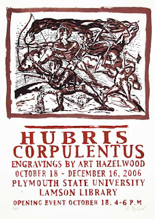
The above is the 4 horsemen piece, viewable at http://arthazelwood.com/prints/Hubris/4%20horsemen.htm. Stop being so fucking lazy; copy and paste the link. 

Iraqopoly circa 2006

www.arthazelwood.com