Saturday, September 26, 2009
#2 closed
Friday, September 25, 2009
Rachael Graham: Blogging Assignment 2
I loved to look at the silk screen titled, smoke and Oakum. I was drawn to its very bright colors, such as red, orange, yellow, combined with greys related to smoke color, and a twinge of lime green. The piece consisted of colorful plumes of smoke, greys and bright colors intertwined, seemingly blowing away from a large fire. The plumes of smoke were very smooth and rounded, but seemingly rough looking at the same time due to the combination of colors!
As I described Smoke and Oakum formally, I realized at that time, that Rau may have been very stressed or angry at the time she created Smoke and Oakum. Since the piece has "fiery" and bright colors, I would interpret that she had been angry. Just the plain fact the the print depicts smoke and fire blowing in the wind, she may have been literally depicting a fiery or angry mood right on paper - A fire blowing away in the wind. I think it is so neat how she makes such a concept so apparen.
ponderings in misanthropy
http://farm3.static.flickr.com/2118/2086073362_b9ca71a07e_o.jpg
The piece I enjoyed the most was the simply done noose piece as well. The simplicity of the colors and the ominous nature of a noose is combined with cool colors and the sensory depravation of the viewer. It made me feel hopeless: as though discarded in the oubliette, gazing at the single source of light and seeing only the hangman's noose in a lucid sky, offering no hope of freedom. Overall, I thought the entire exhibition to be very dark, as was evidenced by her stating she would probably be in prison had it not been for her outlet in art.
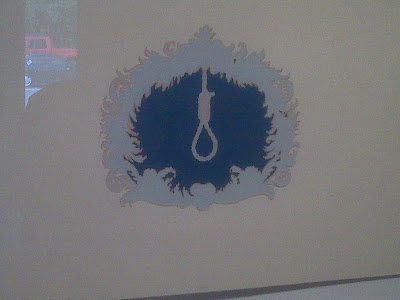
The noose piece itself was done in a few basic colors, and the noose itself was mostly an outline in the clear blue. This was outlined in a flame like structure, breaking up the outline of print itself. The relatively simple focus of this piece as well as the content were what interested me. The size was comparable to the other prints, slightly smaller than the Hardy Boys, and roughly the same size as the dynamite.
hopefully it is forgiveable that my name is not in the post as few of you are going to read it anyway.. [insert sardonic laugh here]
Emily Lyons Assignment 2

kolleen;; assignment two.
Joey Nebiker : Number 2
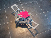
The one piece I found especially interesting was called Leg-hold Traps. There were three hunting traps set up on the floor, as if they were the real deal.
 I haven’t seen a hunting trap in person, but from what I’ve seen on movies or television, they looked pretty realistic. They were made out of actual metal, giving them an added authenticity. In the middle of each trap, was a red awkwardly shaped object, probably intended to look like blood.
Clair spoke about the inspiration for her work, so this piece obviously ties into the whole concept of booby-traps. She wanted them to look as authentic as possible and is currently trying to make them function as if they were real. I think the thought behind the leg-traps was based on her inspiration from combat movies she watched throughout her childhood. She also spoke in detail about her thoughts on camouflage and how it relates to booby-traps. Her work seems to have a hidden message about the ignorance of people and how we don’t always see what’s really there in front of us. The leg-trap sculpture really seemed to embody her artistic thought process in a way that translated easily to the viewer.
Dan Cottle, Assignment Two
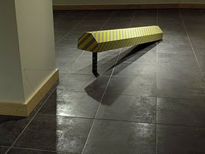
As a whole I found the Claire Rau exhibition very odd. The art work ranged from prints, to sculptures, to noise making devices. Before she spoke about the work I was left with the impression that most of the art was somewhat random and didn't make any sense to me at all. The shows title was "booby traps." She was in a army family so this seemed to influence her a lot.
I chose to write about the noise making booby trap. It is modeled after a Canadian parking bumper. The dimensions are supposed to be exactly the same as an actual bumper. I've never been to Canada so I'm not sure if the gray and yellow stripped colors are the same as well. So there is only one difference between this piece and a bumper; the leg and string which turns this into a trap. When someone walks by it pulls out the leg and the bumper comes crashing down.
As she said the concept behind this is to show how unobservant people really are. Also carelessness. In order to trip the wire you have to walk between the bumper and the center wall instead of just walking around. People generally disregard anything below eye level and of course we do not normally look for trip wires in unexpected places.
Tiffany Blashock Assignment #2

The piece i liked the most is the Log with Staves. It is a sculpture that is made of powder coated steel, cast aluminum. PVC pipe, silkscreen prints on paper, and paper mache. The log part is made of the silkscreen prints. Pieces of the prints are striped with a light brown and cream color. The other pieces of the prints are different images. The prints are to be the bark of the tree. The other part are the spears. They are silver aluminum pipes with paper mache shaped as points at the top of each one.
When i first saw this piece i thought of the movie 10,000 BC. It was used as a booby trap to kill animals or intruders. They would make a big hole in the ground, put the trap in it and cover the top of the hole with leaves or grass so it would be invisible. I thought it was interesting to see some thing like the trap in the movie in person. I also thought it was very interesting how she made the piece. I like how she made the log out of paper. Which actually came from a tree. This piece caught my attention more than any other piece.
Becca Vernon: Assignment 2

Thursday, September 24, 2009
Megan Combs, Blogging assignment #2

assignment #2; Rachel Knight
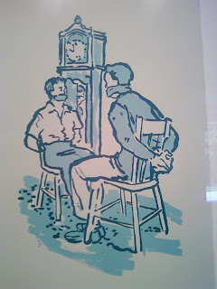
The piece I have chosen is a silk screen print using acrylic paints. Done in blues, the piece appears to be a bit glassy. Another thing I notice is the lack of precise details, which definitely affects the feel of the print. Very clean and sharp, I am very impressed and drawn to the print.
After listening to Claire’s artist lecture I learned that the piece is inspired by a scene in the Hardy Boys novels. I found that very interesting, reminding me of projects I have done in the past using favorite books or stories. My initial thoughts on this piece have nothing to do with those novels though. When looking at the piece I thought of two different explanations. The first one has to do with the literal sense of the piece, which involves the violent nature of the picture. I thought maybe a robber has come in and tied the men up while stealing precious items. Then I thought of the piece in a completely different way, thinking that the men had a major problem with each other that needed to be sorted and talked out, but they couldn’t or wouldn’t do so. In both scenarios the clock and clothing represented a time period, which is not very current. This exhibit definitely consists of some of the most interesting pieces I have seen in quite some time. It was quite refreshing to see Claire Rau's art and to listen to her artist lecture, making me think and rethink the entire idea surrounding art in general!
Sarah Monaco Assigment #2
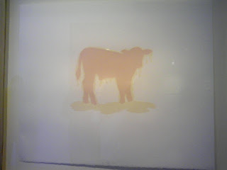
B. The picture above is the artwork I have chosen. The piece shows a pink calf that appears to be drenched in a yellow liquid. A puddle of the yellow substance is making a puddle that rest beneath the calf's feet. The cow, which is the focal point, is place upon an entirely white background.
Assignment #2_Lena Kurtz
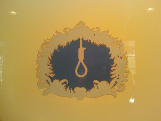 The silkscreen print Cartouche with Noose was the piece that stood out the most to me. It depicts a rope noose framed by a very elegant cartouche. The background of the piece is yellow along with the cartouche and rope being shades of yellow and brown. The center of the cartouche is a dark shade of blue which helps to make the noose stand out from the rest of the piece.
When I first saw this piece, I thought it was about suicide and how people are lured into the idea that they should end their lives. The cartouche makes the noose inviting and hides the real horror that it brings upon people. After listening to the Artist speak about this piece, I believe that I understand the meaning more clearly. Booby traps are meant to lure you in and by placing the fancy framing around the noose, Claire is illustrating that sense of allurement. In the Artist's statement Claire states, "The name itself implies that only a fool or a booby would actually activate the trap...", this shows that people shouldn't be foolish enough to fall for these booby traps but do anyways. I think that Rau wanted to show how dimwitted characters in stories and movies are who fall for the elegant designs and fancy trimming of booby traps instead of turning away from them.
Second Art Show

Tuesday, September 22, 2009
Blogging Assignment #2
The photo I took, located at the bottom of this composition, caught my eye over all other works. It has an elegant outline, almost like a fire, in the same color as the noose located in the center. However, this isn't all that made me want to look closer. There is a bold blue consuming the center between the outline and the noose, allowing the noose to call attention to observers. The noose is attached to the "firey" outline at the top center. I have drawn conclusions about this particular design.
Once conceptually analyzing this depiction, I feel as though I understand it better. Although it is often difficult to understand what the artist was thinking or feeling when making a piece, I gave it a shot. Morbid as it sounds, this image resembles feelings of depression or anxiety in my opinion. The noose is the main attraction and the design encircles the noose, closing it in. The bold blue separating the two makes it stand out even more. The fact that the noose is attached to the design could signify that feelings of depression or suicide may be led astray if you are feeling that way, but it can come back around to those thoughts yet again. The design may not relate to every person who sees and observes it, but it certainly holds meaning to the creator and possibly others.

Saturday, September 19, 2009
Friday, September 18, 2009
Becca Vernon: Assignment 1
B. The piece I chose to write about, is one titled Memory Game. There were two major parts to this piece. The first part was a combination of photographs and childhood stories to go with the pictures. They were hung on the wall, in a tile-like format, alternating between the photos and descriptions. The second part was below, on a table. This part of the display contained many small wooden blocks, also with photographs, and phrases on them. Like many other pieces in the exhibit, Memory Game was mostly black and white, with shades of grey. The only part that took exception was the small wooden blocks, as the photographs were more sepia-toned. I enjoyed the clean, orderly look of the piece hung on the wall, as well as the conversely cluttered and sporadically arranged blocks.
C. Sue O’Donnell shared her memories with viewers of the exhibit, through pictures and the written word. Although some say pictures are worth a thousand words, I think there was a specific reason why O’Donnell felt the need to thoroughly explain the images. I believe she wanted the viewer to not only relate the memories to themselves, but to also hear and personalize her own memories. This also strengthens her point to the viewers who may not really get what she’s trying to say just from the images. I feel like I can relate to how she tells her story in more than one way, because I often feel the need to clarify to people about what I am trying to convey.
Thursday, September 17, 2009
Dan Cottle, Assignment Numero Uno

The exhibit at the Haas Gallery was by Sue O'Donnell who is a professor of digital art. The art work was for the most part hung on the wall but two of the pieces were sitting on a pedestal. The lighting was set up to highlight the art. For one piece she utilized backlighting to show off the transparency of the book. The works all seem to be related and the subject seemed to revolve around her memories; the good and the bad. The pieces all shared a very graphic style and a small pallet of mostly black and white. The show was basically a snapshot of her life as a whole so it all went together very well.
The piece i chose to write about is made up of 24 square ultrachrome prints. There are no colors; just black and white. The shapes are all organic. The shapes are made up of text and spaces where she cut away text with an exacto knife. The shape as a whole looks like a distorted animal. There is a second part to the piece off to the side, it is the jar of all the
The reason behind this image is to show a narrative of her life and to let her let go of bad memories. When she printed it out she had not yet cut away any of the image, but she realized some of the text was too personal and she could not leave it all there. So she cut it away and put it in a jar. This I think let her feel more free while letting go.
Megan Combs, Assignment #1

Sue O'Donnell's collection of pieces in her exhibit entitled "Memory Maps" forms a cohesive whole. The work is made up of several pieces of art which stem off of one another to create a lifetime of memories. These individual works are set up in an organized way that both allows the viewer to move easily through the whole exhibit and makes sense. The text in the display transitions into each "map" which then also transitions well into images and various other art media. Each work combines to create a sort of timeline, so one individual piece is definitely influenced by the previous one. Each piece is a part of a story and the whole series forms a sort of artistic biography.
My favorite piece in the exhibit was Memory Game. I chose to write about this piece of work in the exhibit for a number of reasons. The formal elements of this piece that I enjoyed were the use of black, grays and white as well as the combination of wall mountings and blocks. The two separate but consistent objects work very well together to form a whole. It is important that the pieces on the wall are square shaped, any other shape--even rectangular--would not work as well because of the addition of the sort of "memory building blocks." Another formal aspect of this piece that I found important was the use of not only textual elements but visual elements as well. I find it extremely important to utilize both since a memory truly relies on being expressed by these two things. This made me think of a scrapbook which also lends to the idea of preserving and letting go of memories.
I really enjoyed the fact that this piece was interactive. I was intrigued by this not only because of the obvious interest that a viewer would have in any interactive work but also because the hands-on side of the piece was really important to me since I felt a very strong connection with the whole collection of work. Obviously my life is nothing like that of Sue O'Donnell's but the idea of letting go of all of the memories and secrets that she sort of set free through this body of work was something that I felt I could relate to. It just seems to me that this would be such a weight lifted (to have all of these thoughts organized into one "memory map"). It was such an incredibly personal work of art, as was the entire exhibit as a whole.
Emily Lyons, Assignment 1
 I think what makes everything work in Sue O' Donnell's show is the words she has on each work. You see a picture but the words explain the picture so well. She had multiple pictures of her younger years and had next to it an explanation to what the picture meant to her. The words on each of the pieces had a specific meaning to the piece of art that she had in the show.
The picture has mostly black and white. She also uses geometric shapes with abbreviations in them. The bottom of the picture it says "Risk, Love and Realization." She uses lines to intertwine the lines and shapes so they cross each other. Also along the left side of the picture she has years from 1970-2006.
This picture is very interesting and looking at it I thought at first that maybe she was trying to say that throughout her life these three things, Risk, Love, and Realization, all intertwined. But then I was thinking about how she had the years along the left hand side of the picture and why they were there. I think that she put the years there because in those years she had one of those three things happen to her. She has Risk, Love, and Realization plotted like a graph next to the years on the picture. In 1970 she had a risk that she made and as you go down the years she shows you that she had either love, risk, or a realization. Sometimes she had more than one at a time in the same year. It is interesting to look at and see how many risks she had to take or when love appeared and to see the realizations come in as well.
Lena Kurtz_Assignment #1

Run is the title of the work I have chosen to talk about. The image is of a girl in a plain white dress with a red bow running through the grass. This piece was created from a sequence of still frames from a film of O'Donnell running as a child. Altogether there are about 20 separate images in this piece. They begin with just feet entering the picture and progress to include the whole body running through the separate images and ends with the runner's head exiting the last image. The images are arranged in a straight line sequence across three walls.
I think that Run is a very straightforward piece. It portrays the simple but important memory of the joy of running around as a child. I know I can look back and remember having more energy than I can imagine and feeling like I could run and never stop. It's basically a universal memory that everyone can relate to. I think the idea behind this piece is to stir up the memories of it's viewers and help them to remember their past. I think it also shows people that though we may have different pasts, there are many memories that all of us share and can relate to each other through them.
Wednesday, September 16, 2009
The exhibition of the works of Sue O’Donnell in the Haas center was a collection of pieces on essentially the same topic. The arrangement did not seem to be in any particular order. The pieces were arranged in a circular fashion so that one had to walk cyclically in order to view all of the pieces. The frames were simple, in order to keep the focus on the digitally produced art. There was quite a size variance in the various pieces, immediately upon walking into the exhibit there was a small 8x12 piece. To the left there was a jar filled with what appeared to be the text from one of the larger pieces. A few other pieces were of various sizes, some were connected and more than six feet long, while others were large and rectangular. The arrangement of the pieces could have made more sense, upon viewing the entire exhibit, it was apparent that the theme was time and memory, however it wasn’t arranged in a linear fashion, as we generally think of time as being arranged.
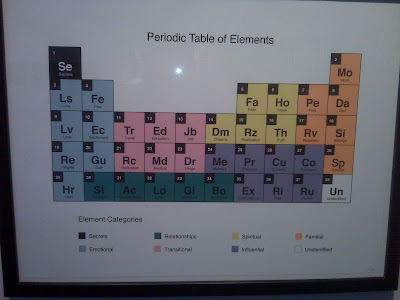
The piece that I was attracted to enough to write about was the periodic table of her life, which detailed the elements of her life. While it was a stylized periodic table, the basic idea was that each block in the table represented a certain part of her life, and the common theme between this piece and the others was time, memory, and remembrance. It was a very geometric piece, consisting of bold lined squares, in a dodecagon configuration. Furthermore, there was the use of secondary and primary colors. These included pink, black, white, light cyan, yellow, orange, mauve and teal green. The periodic table had 38 elements in it. Each was numbered, and easily readable, in a very scientific manner. This piece was very neatly done.
The meaning behind the periodic table would be obvious even if the piece was taken by itself. Each square was a separate word that had significance to the artist; each word was a special part of her life. This related to memories, and pointed towards the future, for example boyfriends is probably a past memory, assuming that the spouse in the familial period is current. One thing that this periodic table is missing is periodic trends. Furthermore the arrangement of the elements themselves doesn’t make scientific sense. However, at first glance the periodic table is a neat way to arrange the elements of her life.
Tuesday, September 15, 2009
Rachel Knight; Assignment #1
Memory Maps by Sue O’Donnell is a rather captivating exhibit which strikes me as being slightly nontraditional and full of meaningful memories, sparking many different emotions. The interesting use of digital photography with many words and phrases throughout the art creates a timeline like exhibit that flows extremely well. The modern look of the room the exhibit is set up in definitely fits with her artwork and due to the impeccable placement of each work, the entire exhibit flows from one piece to the next fluidly. While each piece complements the next, they all could also stand alone very strongly. A story full of memory and growing up can be quickly noticed when admiring the show. A theme to this exhibit is words, which exist in the majority of pieces making a great presence. Some of the pieces are framed in bold black frames, while others do not have any frames at all. Wisely decided, this simple factor does quite a bit for the exhibit as a whole. The variety of pieces and dimensions shown in the room are definitely admirable due to their creativity and quality. The only criticism I have for the exhibit is that I would have loved to see more art, especially to fill the pillars in the center of the room completely.

The piece entitled Memory Game definitely tells a story through pictures and text. The square ultra chrome prints on wooden blocks form a clean structured rectangle that stands out of the wall slightly. The squares go photo, text, photo, text and so on. On the table below the piece, small cubes are scattered about with no particular order. Like the piece on the wall, these cubes contain photos of a little girl and text that depicts stories. Unlike the black and white prints hanging on the wall, the ones printed on the cubes lean more towards a sepia tone. They also contain text in the form of phrases, rather than the stories that hang. Extremely clean cut, the two parts of this piece most certainly complement each other. While they appear different, they contain the same meaning and tell the same sort of story.
Fitting the exhibit perfectly, Memory Game is a very important piece, obviously representing memories. This piece in particular focus’ on growing up, containing pictures of a little girl in many different settings, making me feel as though I was flipping through a family photo album. The text all contain different stories, which almost seem like they could be from a journal, also reminding me of silly things I did as a child and other important growing up memories. The idea of commemorating memories and events into art is something I admire and enjoy. It also reminds me of how important it is to take a trip back on memory lane. When I look at this specific piece I can tell right away what it is about and see how personal it is to the artist. It also helps me understand the rest of the exhibit and appreciate it more. To me, memories, family, and growing up mean a whole lot to Sue O’Donnell, so much that she has created a great exhibit out of it, reminding me to also cherish these simple things, called memories.
Joey Nebiker : Assignment 1

I was intrigued by the installation based on the idea of behind the work. The concepts behind the artist’s works were centered on memory. While art is usually personal, it seemed that the use of memories allowed an even more personal bond between the artist and her work. The room was set up in a very orderly fashion. The white walls made the room visually and aesthetically calming and very relaxed. Her work was clearly cohesive but by no means similar from one piece to the next. Also the pieces that were visually linked seemed to be spatially separated allowing for a more random and disjointed approach to the experience. While most of the work was in frames, some were in jars or even on blocks. Overall the exhibit was very well put together. Clearly a great deal of effort was put into the flow of the room, as well as the pieces themselves. I really enjoyed the creativity behind the idea of the artist’s self portraits.
There was one piece I found to be most interesting called Story Told. The artist described the piece as an accordion artist book with shelf. Visually the piece is made up of an accordion style picture frame with clear glass on both sides. There were 12 separate black frames linked together by hinges. Each individual frame was unique inside but filled with the same items found in all the others for the most part. In each frame there were words and sentence fragments stacked on top of each other. The words were printed on transparencies and cut out in rough, jagged shapes. Surrounding the words were box-like shapes drawn in black ink. Some of the boxes were bigger than others, some overlapped each other, and some were drawn darker than others. There were also random and erratic lines drawn in-between the boxes in some places that were similar in shape to a tornado. In each new frame these same elements were used, just different boxes and lines, as well as different words and sentence fragments.
My thoughts on this artist’s intentions with this work are not exactly clear. I like the work because it’s complex and not very easy to figure out. I would assume that each cluster of words is a story from the artist’s memory. Each story is separated by an individual frame but linked to another story in the accordion frame. This might represent the idea that stories from memory are often different and separate but linked together somehow. The idea that the stories aren’t simple to read, but overlapped and difficult is another interesting aspect of this piece. I think the artist was intending to show that memories are disjointed and stories overlap. When you tell a story from memory it’s never the same twice. I feel that the artist was trying to show the complexity and randomness of memory. It’s not just something you can call on and read word for word each time. This piece seemed to show memory as I see it, which allowed me to relate to the work in a more personal sense.
Friday, September 11, 2009
Tiffany Blashock Assignment #1

Thursday, September 10, 2009
Kolleen Keister; assignment #1.

The exhibition was in a medium sized room that was painted entirely white. Spotlights illuminated each piece of artwork that was on display in a warming tone. Each artwork led you to another one, which was either extremely close in resemblance or just cohesive in the sense of its meaning. The artist displayed her pieces in the following ways: frames, photography, stackable picture/word cubes, short stories, and picture frames. There were so many different elements of the exhibition coming at you all at once. Although there was a lot of visual attention directing your eyes, all of the displays were connected allowing it to be sentimental while simultaneously remaining to be visually pleasing. What I really liked about the exhibition is the fact that mostly all of the artwork was in black and white. Color was splattered here and there, but mostly black and white was seen which gave a more deep and powerful image. I honestly do not think that anything should be change about the exhibition except maybe I would have liked to see more artwork on display to interpret!
B.
The artwork was made up of perfect small squares arranged in a way to make a larger rectangular display. The entire design was purely black, gray, and white containing numerous organic blobs either filled with scribbled writing or what looked like writing that was erased away by white. The white blobs look as if it they were carved out of the black print and the writing was blurred to a point of illiteracy. The shapes were all a little bit different and unique but were all generally following the same format. Most of the blurbs were gathered around a central point and flowed outwards. Glancing from far away you cannot quite distinguish what is going on, but moving close up to the piece you notice an entire different perspective. The blurbs seem to be arranged in a random way connected by lines.
C.
My interpretation is that the artist wrote down her thoughts and displayed them in a messy, chaotic way. I feel like the artwork is displaying how our minds think. All of the blurbs are the many thoughts going through her head all connecting back to one another in an obvious or subtle way. The piece of artwork is like a novel of her life but broken up into speech bubbles. Each blob has a sentence on it expressing her thoughts and opinions. The small blurbs are nostalgically retelling her past of the happy, sad, mad, and guilty times she has had. The artwork, like a stream of consciousness, is unedited, spontaneous, and is what came to her mind at that certain moment in time. The entire piece is like a huge brainstorm of her childhood, retelling her thoughts. The blurred out writing I feel like are memories that she has either forgotten, chosen to block out, or might be future thoughts that she has left room for in her mind to fill up. It just shows us how at every moment of our lives we are thinking, our minds are constantly running and everything we think is important. I really enjoyed viewing this piece because it just reminded me of my childhood and the many memories I have.
Rachael Graham: Assignment #1
One of my favorite pieces was the "Periodic Table of the Elements." The piece was comprised of precise, geometric shapes, squares to be specific. The setup looked exactly as a scientific Period table would look. The colors used in O'Donnell's periodic table are much more vibrant than colors used in a science textbook and certainly much more vibrant than the overall color scheme of the exhibit, such as bright yellow, dark teal, light pink, sunny orange, an indigo purple, light blue and black. Displayed below the table was a legend to the table, matching the colors to a group of Sue O'Donnell elements: Orange=Familial, Yellow=Spiritual, White=Unidentified, Black=Secrets, Indigo=Influential, Green=Relationships, Pink=Transitional and Blue=Emotional. Each "element" had a certain word which fit among each category, such as Love (Lv), which was also represented by a tiny white number in a little black square in the upper-left hand corner as well as a two letter, capital and lowercase, abbreviation.
As I was thinking about Sue O'Donnell's piece, "Periodic Table of the Elements," I realized that it seemed to be an oddball among the other pieces in her exhibit. The use of a variety bright colors, the very clean and crisp style, one style of lettering, seemed to set it apart visually, and also made me realize that it may have been a piece representing a certain point of recovery after her husband's death. During O'Donnell's lecture, listening to her describe the development of her art after her husband's death, it seemed to me that she tried many different, crafty, experimental ways somehow present her feelings in a visual sense. For the most part, each piece in the exhibit is so obviously very personal, and seemed to be put together in such a fragile, painstaking way, so as to express every detail she could: the toy blocks representing tiny moments of life, each cut out of a secret in the jar, the rest of the tiny, handwritten memory cut outs of her life spread into a map. Everything was right there for you to see and relate to. "Periodic Table of the Elements" seemed to me, to be a point in which she felt she needed to step back, and organize all of the emotion and priorities moving around her head, like writing a list in order to release the stress of food shopping, or something of the sort. "Periodic Table of the Elements" is a straightforward representation of everything that she cared about; a reminder of the important things in life that she has, all in kind of organized form, where she can view and look at it without everything rambling through her head. The piece is not too elaborately designed, or displayed in any special way - it is a human, down to earth, organization and reminder of the "elements" of herself - the point in which she needed to step back and view the important things in life in a certain, organized fashion.
Assignment #1

Shelby Spressart
9/10/09
The art gallery in the Haas Center was a very nice unique gallery done by Sue O’Donnell. I think that the work all went together nicely and flowed through the room well from piece to piece. Most of the pieces are black and white with words in them, where you have to look closely at the piece and study it. Some consist of color, which are mostly photographs. Everything flows and has a similar theme. She is not all over the place with her art, but more consistent in her ideas. Most of the art is framed and others are set on something rather than placed on the wall, which lets the observer move around and get close to it.
The image I chose is a circular piece in a square frame. It is black and gold in its colors. It is almost shaped as a pie piece if you look closely at it, because she divided it up into sections, while at the same time, she has gold lines coming out from the center.
I think this piece is similar to her periodic table of elements piece because she has similar words which are divided up. The circular one though is less straightforward and makes you think what she is trying to say. I think she is trying to express the different words she wrote in sections and break them down into meaning while at the same time she has craziness with the lines. So maybe all the meanings intersect at some point or they really cannot be broken down.
